Understand Endurance Data
Jakob Ohlsen Published: 13th December 2017
Since some people asked how one can understand the graphs on the result page of a single athlete I will try to explain this kind of race visualisation. Let us take the Ironman Hawaii 2017 as an example to understand the graph, how it is generated and what can be seen by looking at it.
Example: Ironman Hawaii 2017
The first thing I would like to point out is, that one can not see exactly how fast an athlete was at a specific point of the race. This graph is all about comparing athletes with each other. So if for example all athletes in the graph would perform (equally) bad during the end of the bike, nothing in the graph would indicate this. To take a look at our example: If one would only see the graphs of Patrick Lange and David McNamee one could assume that they had a very constant performance on the bike. Maybe they had, maybe the did not. What you can see in the graph is that there were a couple of guys, who were much faster during the bike leg.
But first things first. Let's start with some general understanding. The graph shows the difference in time to a specific athlete (here Patrick Lange) throughout the whole race. Since the split times are just accurate at the corresponding timing points the differences between those points are assumed to behave linear (in a straight line). The more timing points a race has the more accurate one can reconstruct the course of events throughout the race.
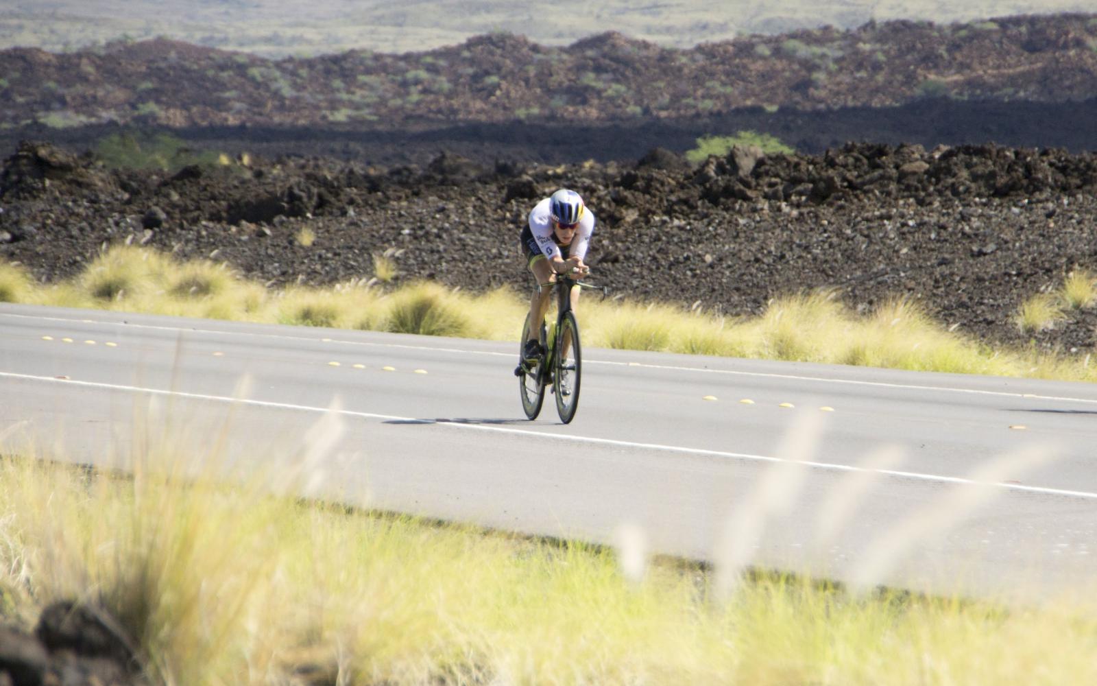
Back to the example: Since Lange swam faster than Kienle, his graph is placed above the slower swimming performance of the "German uberbiker". Sanders had a similar swim as Kienle and one can see that they overtook Lange after approximately 70km on the bike. James Cunnama, who was riding not far behind Lange at that moment joined the fast bikers and could stay close to them for around 50km. Thats where Sanders decided to catch Kienle (later he said, that this move might have cost him the win). At T2 Sanders was more than 9 minutes ahead of Lange, who started his blazing fast marathon alongside of David McNamee. During the first 8km of the run Sanders kept the gap at around 9:30min to Lange but had to pay tribute to his high pace on the bike and maybe also during the first kilometers of the run. Close to the timing point at 38km Sanders was then passed by Lange, who finished with a course record of 8:01:40.
I hope this text could help you to understand the idea behind the Endurance Data graphs. If you still have questions or suggestions for the graphs, statistics or the page in general, feel free to contact me.


